It is very likely that if this is the sort of site you read, you’ve probably already heard that John Romero released a new Doom map, his take on e1m8. Many note that this is substantial due to how long it has been, but my takeaway was that it made it possible to play all of the first episode of Doom encountering only maps by Romero. E1M8 was designed by Sandy Petersen based off of scraps from Tom Hall, and it being a different mapper worked for a boss level, as the level signified change. It had the most somber song yet, and the clearest presence of the Hell themes. It was transitioning you to Shores of Hell, an episode with many maps by Petersen.
I’ll be reviewing the map on its own merits, but also in the context of being the level following E1M7, and of being constrained to the shareware content. Below the cut you’ll find not just the review, but my first playthrough of the map on YouTube. Due to GZDoom crashing and corrupting the video, you missed out on my first five deaths, so this video (recorded in ZDoom) has me changing my strategy and being aware of one secret.
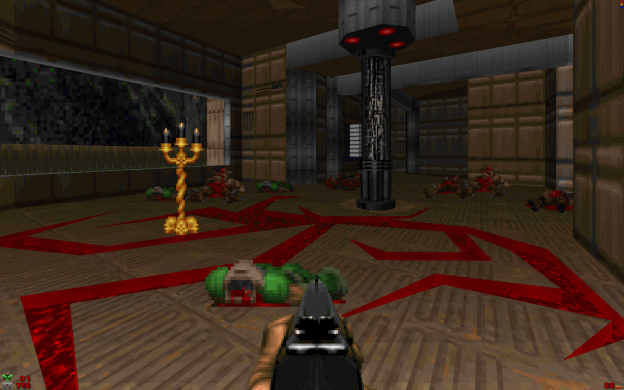
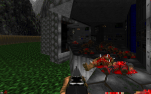
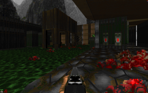
E1M8B, Tech Gone Bad, uses all three of the keycards in a clear succession of requirements where the level internally unfolds as you progress, with the exterior being the most accessible – despite the danger of the slime ocean surrounding the map. The level starts peacefully in that no enemy is facing you, so you can look around briefly without being disturbed, and if you’ve not played a game like Doom in a while, now is your chance to take stock of the fact that this is not modern level design; this is level design meant to facilitate gameplay rather than story. You can see two routes, a shotgun, and a view into another section of the level. In fact, at any given point, you typically have a choice as to where to go, and a vista into another area. Romero continues to demonstrate, as he did with the original horseshoe design of E1M1, that you can use a 2.5D engine to make a more three dimensional space than thoughtless design would make in a 3D engine.
The level is a delight to explore, without feeling linear, or getting lost. The texture themes vary while remaining consistent in the overall tone, so simply by looking at a nearby wall you know where you are in the overall progression. In this regard it serves as a visual microcosm of episode one as a whole. The combat however does not, and the opening has more in common with American McGee’s E4M1, as the initial shots fired will summon multiple monsters to teleport in right at the player start. If you are starting on this map, you will find the fire rate of the pistol and the shotgun to be underwhelming against the number of targets. I quickly realized that without a chaingun, I could not hold the first room, so I opted for grabbing the shotgun, sprinting out, and then reclaiming the room from without by making use of sight lines. I later returned to the level and spawned with a chaingun, and found that the first room was very easy with a high fire rate weapon. In this regard, the opening certainly still has excitement, but less danger, and lacks the drama of Petersen’s slime pit of demons.
After that the difficulty, when played either way, was moderate to mild. I found only two secrets in my initial play through, a mega armor and a soul sphere, and needed nothing more. My health never even went back down into the normal range, so I took little notice of medkit availability. The combat does seem authentic to the initial release in that it is more balanced for keyboard only play – the ability to quickly sweep a room visually and intelligently move based on what you saw makes the mouse dominant over the combat here. Because of this, I didn’t feel any pressure outside of beginning the level with a pistol, though there is a nice large fight leading up to the Barons of Hell. I should mention that I did thin the numbers in a few areas early on, when I grabbed a radiation suit and opted to sprint around the outside of the map, taking potshots at visible indoor enemies as I went past.
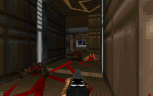
The Barons of Hell have a nice and dramatic entrance, in a room that makes it feel more like they arrived through the site of the UAC’s experiments, but their hellish presence was undermined by the supporting cast of former humans in the room. A presence which had been built up to nicely by the cracks of hell materials spidering through the facility, adding to the mood.
The mood as a whole is strong, though slightly different with more explicitly implied (it’s not contradictory!) functionality of structures, since the map didn’t have to worry about 386s and could have objects with higher linedef and sector counts in sight. But the mood does falter as an E1M8 replacement. E1M8 is the peak of the episode, the final measure in what is an ever darkening composition. In the original, it literally descends into darkness, as the preceding levels were gradually darker and darker. E1M8b however is fairly bright. Almost cheery, like E1M3, and though this can’t be helped much due to having so much of it outdoors and the only non-Hellish skybox taking place during the day time, it clashes with the music, which seems to match mostly in two different spots, though never with the pace of the action.
You might notice the length of my video: I do have a cautious play style, but I also got stuck at one point, and I think it was my playing the metagame of secrets a bit too harshly. In the area beyond the yellow key, you get a few nice ambushes where monsters are trickling in behind you, as well as waking up to your presence ahead of you. Because I heard them behind me, I didn’t press forward to two very prominent switches, and thus explored other areas first, including discovering what would become the bridge to the red key. Without having raised the bridge, I mistook the architecture as being that of a secret which I needed to decipher, so when I did raise the bridge, it took me a while to mentally connect the space it had spanned, and the path to it. I am inclined to attribute this delay more to my playstyle than to John’s design, as the bridge raising does make you more aware of the Z-axis in the halls leading up to that point.
On the subject of the secrets, I ultimately found 9/10, but I only ever needed the first two I had found. The level is very generous, even on Ultra-violence. But barring a few exceptions, I wasn’t fond of the secrets. Often after finding one I’d step back and look for how I could’ve known to press Use on that wall, but, I rarely did discover an indicator. I just humped the walls until my “Unh!” was replaced with metal sliding on hydraulics, making most of them unrewarding to find, especially considering how generous the non-secret spaces are with supplies. Two of the secrets are particularly anomalous for two reasons, the first of which is functionality. There is both an Invulnerability sphere, and a Berserk Pack, on a level with two soul spheres and a mega armor. The only fight where an invulnerability sphere would be useful is very far from it, making it valuable to pickup only from a completionist stance, and the Berserk Pack is incredibly powerful for the tier of monsters available in the level.
The second reason is the fact that this is E1M8b, vaguely following the shareware. There are no Lost Souls, Cacodemons, the other bosses, the Plasma Rifle, or the BFG. Yet the Invulnerability Sphere and Berserk Pack didn’t appear until E2M7 and E2M2. They’re registered content, and their potency (and arguably necessity) dwarfs the shareware monsters.
I did encounter a few mild hiccups like the rather unceremonious placement of the blue keycard, some linedefs that could catch the player, a brief hall of mirror (though credit goes to Mechadon for pointing it out before I got a chance to play), and an empty, theoretically inaccessible alcove with a one-way only door into a secret area I had already found.
This has read like a lot of complaints, but, they aren’t. It is still a great level, and it demonstrates that John Romero still has it. The comments are me unpacking the level as it stands in the context of being an E1M8 replacement, and fitting within the confines of the shareware. I highly recommend it. It can be downloaded from John Romero’s Dropbox.


The invulnerability can be used at the start, rush down into the gutter, hit the secret door at the right hand, and get the invulnerability, and go to town.
The beginning is very hard, and this made me think there must be an easier / sneeky way to do it. And the inv is the way. Look up a ‘speedrun’ 8’41” of this level to how it’s used.
I thought it was an interesting level because:
– the crossing and looping paths,
– the visible influence 3d level design has made on this level,
– the summery of all the typical cool Doom mechanics in 1 level,
– love the red crack design,
– like the good use of textures,
– Lovely to see John speak through this level.
Thinks I didn’t like about this level:
– the design prevents running, it’s cramped,
– The wall around the level looks very boring; it needs some landscaping,
– after the difficult start, and other challenging parts, the end boss part feels easy and underwhelming.
ps. I’m still looking for more critical reviews. Most are lacking any criticism, and are a complete fanboy reviews. Sure I’m delighted too with Romero’s game and his new level, but can we still find a bit of spine to make a review that is somewhat balanced? Just imagine a ‘nobody’ has made this level; how would you judge it? In this state I think it deserves a 7,5 out of 10. Work on the negative points and add a more impressive and layered crescendo, and it would easily rise to a 9.
Ah yes, Nevanos, I enjoy his runs. I see now, the secret right there was one of the last ones I found, after I had completed the level. That is making good use of it.
I was fond of the three different themes present in the level, while all being Phobos Labs in general feel. I didn’t feel cramped, but the outer wall did need some detailing for sure. And yeah, two Barons is really not as difficult as the initial fight, or the fight before them.
I don’t know where I fall in terms of another’s definition of fan boy, but I was interested in how the map would be because Romero formulated very early on what made a Doom level, with specific rules to enforce that formula. The thing is, I liked this level, in general, and most of my problems with it came from a rule it had applied to itself, of being thematically part of the shareware.
It makes me wonder what he has planned for Romero Games, Ltd, which he just declared himself President of rather recently.
Romero Games, Ltd?
Cool little information there!
I like the level in general too, hence my 7,5 / 10.
I don’t think limiting oneself to episode 1 features does automatically prevent a top map design score. The first 4 out of 13 levels I’m making for my megawad have only the former human, sergeant, chaingunner, imp, caco, deamon, pistol,shotgun, chaingun in them and my test panel are having blast. Why, because it’s about how to compose cool inventive scenarios that challenge the player with something new. And these days doing anything new in FPS, or most other genres, is really hard. I had great fun discovering Romero’s sneeky way to do the start. I had also great fun.. well it’s in my post above :)
Thanks for the reply, and your head’s up scarecrow! – keep up the good work!
If you want to check my work just write me a mail. Thanks!